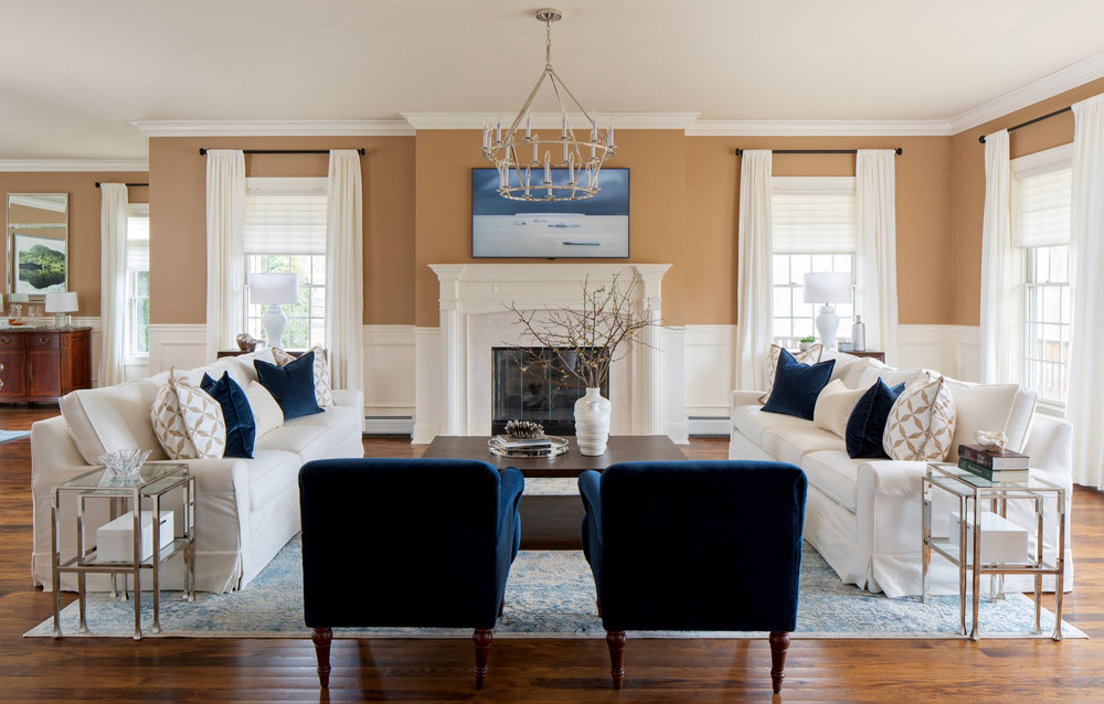
Faced with an exacting dark wall color to work with throughout the home, Décor Aid interior designer Caroline Patterson injected light and airy elements for a refreshed take on the traditional.

Braced with a new home that also came with some existing furnishings, our client knew he had an eye for traditional interior design, which paired well with the architectural details of the space, but was short on ideas to make it feel more personal and inviting.
The family home already boasted plenty of natural light, yet the dark caramel tone of the home called for light furnishings to keep the open floor plan of the living room and dining room feeling refreshed and well-judged. The overall approach here was subtle with a minimal spirit.
To counter the traditional design of the home, Julia brought in pieces with modern finishes like chrome and glass while keeping the overall look and feel simple, and easy on the eye.
For consistency and a serene feel, Julia stuck with a tight color scheme that included white and khaki along with navy blue for a sense of strength and a slight nautical feel. Distressed blue area rugs were also placed in the living room, dining room, and foyer to tie everything together.
Since the dining area featured several wood furnishings, Julia juxtaposed that heavy feel with a large photograph of Ireland in an ode to the homeowner’s heritage that instantly lightened up the area.
In the living room, area she created soothing symmetry with two large white sofas paired with navy armchairs for a straightforward approach. To keep the room practical yet refined, a custom framed television that displays art when not in use was installed. And to evoke a sun-drenched feel in the evening, Julia brought in a two-tier chandelier with a dimmer to keep the space comforting and cozy.
Window treatments were raised and refitted throughout to trick the eye into thinking that the ceiling is higher than it actually is. Julia tackled the foyer last since she wanted to have a continuous and consistent feel in the space. The original setup was off scale so she went with a more substantial wooden console table paired with white decorative accents.
All in all, since the home boasted ample windows, high ceilings, and a classically outfitted fireplace, it was made for traditional design. It simply needed some clever updates for an elevated feel that’s both timeless and modern in spirit.
