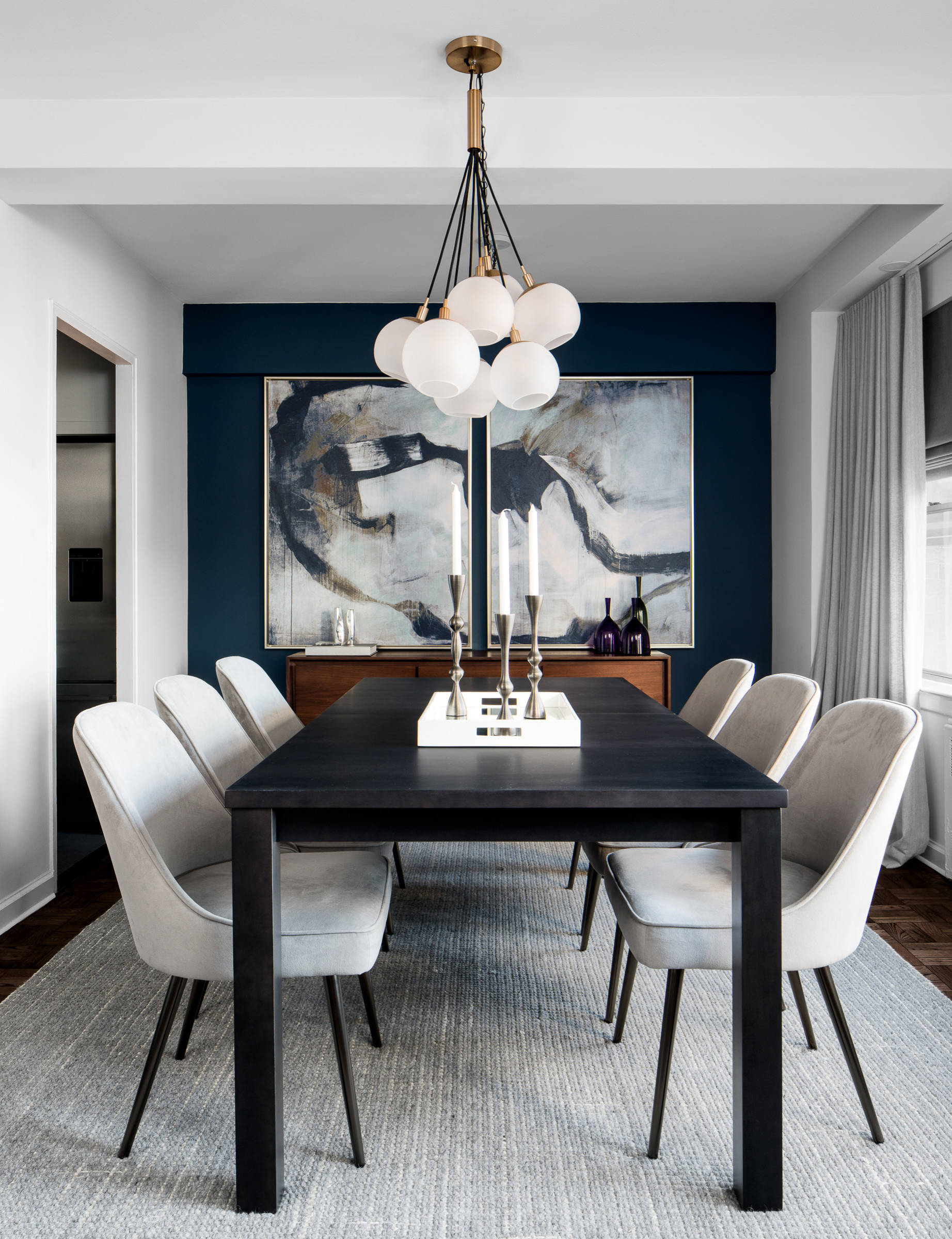
When a client turned to Décor Aid to make their family home both kid-friendly and timelessly stylish, interior designer Vivian C. set about to create a living room and dining room by sourcing furnishings with curved edges to help alleviate everyday wear and tear from their young children. The end is a Mid-Century Modern apartment makeover that boasts character-defining décor.

For their Pre-War apartment on New York City’s Upper West Side, it was essential to create a playful environment for their children while the areas could also inspire endless nights of entertaining guests in style. As our clients took Jonathan Adler’s Mid-Century Modern hotel in Palm Spring’s as central inspiration, she introduced sophisticated meets contemporary Mid-Century Modern interior design throughout the home while taking in their laid back and casual spirit.
To pay respect and highlight the architectural features that are signatures of classic Pre-War structures, she kept the color palette neutral and clean to blend the architecture with the furnishings.
With the dining room being central to the space, Vivian knew her most formal mark would be made here. The dining room was reborn with a more dramatic palette of black, white, and grey. This lent the room a more sophisticated and polished feel with a striking black and white color scheme elevated with a glass bubble chandelier that adds extra light, and beautiful reflections that play off of the dark wood of the dining table. The sleek dining side chairs were offset by tweed end chairs that have a small grey and white geometric pattern to break up the darker pieces in the room. The statement-makers of the dining room are the glass bubble chandelier and a sideboard boasting pearl inlay that play off each other to create a classic, contemporary boutique hotel dining experience.
She played off of the bright and punchy colors in Adler’s hotel to update the feel of their existing Mid-Century style sectional, side chair, and entertainment unit in the living room. The goal here was to create a cozy, kid-friendly environment where the family can relax and also entertain. Vivian created moments of color via sumptuous navy velvet drapes from Anthropologie and a crimson velvet chair that boasts a minimal silhouette. She brought in extra vibrancy through an area rug that boasts texture and color while serving as inspiration for the blue and orange accents featured in the accessories and throw pillows.
The result was a whimsical play on the eras unmistakable silhouettes while injecting the space with hits of graphic touches and energizing color. A comfortable, chic, and practical space that can be used for entertaining that’s safe for the kids to enjoy as well. While the project started out with a more Mid-Century Modern bent, Vivian brought in elements of different design styles to update the space and make it completely unique. It has moments of a downtown loft feel with a modern yet cozy dining room and a living room that has more punchy, unexpected colors. And although the rooms are somewhat different in feel, she ensured that they would correspond well with one another to create a chic, vibrant home.
When asked about the best part of the interior design process, Vivian was happy to report that she had a wonderful time collaborating with our client and that it was a brilliant marriage of the minds. After all, a happy home and client are all an interior designer could ask for, and Vivian found pleasure seeing her vision for a space turn out even better then she expected.
