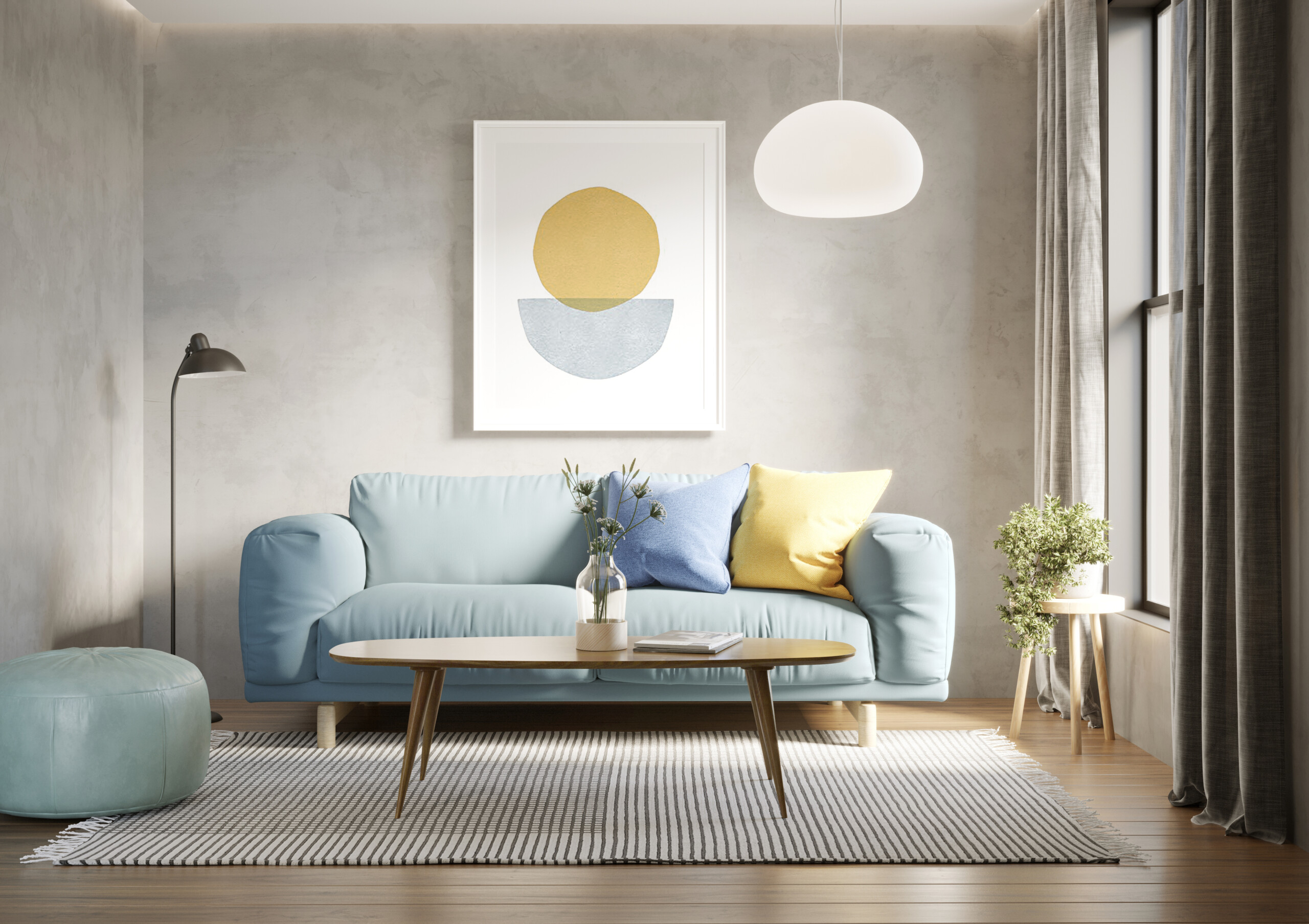
Have you ever looked at a room in an interior design glossy and wondered how they got it to look both lived in and perfectly styled as though it took no time at all? Wonder no more with these simple, creative and easy to implement tabletop styling tips that cleverly utilize what you already own to instantly upgrade and refresh surfaces from room to room throughout your home.
Play With Various Elements
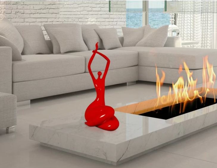
The immaculate symmetry from our project above would have looked a tad stark and overly masculine if our designer hadn’t elevated the conversation area’s accent table with a small stack of inspiring photography tomes and an oversized sculpture for added dimension. Take note of the sculpture’s crystal clear fabrication as it doesn’t add any weight to the tabletop nor will it block whoever happens to be sitting behind it.
The arrangement also adds some extra height to the setting along with an eclectic touch – making it the perfect pairing for this small table.
Add Drama To A Home Bar
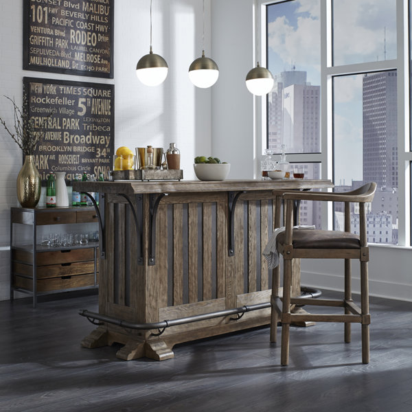
For a bar cart to elicit beautiful decor rather than a straightforward libation station, stagger various essentials with matching pieces symmetrically featured like the lamps above, which in turn give the surface an elegant, refined vibe even though it is just a simple bar.
Make Use Of Forgotten Spaces
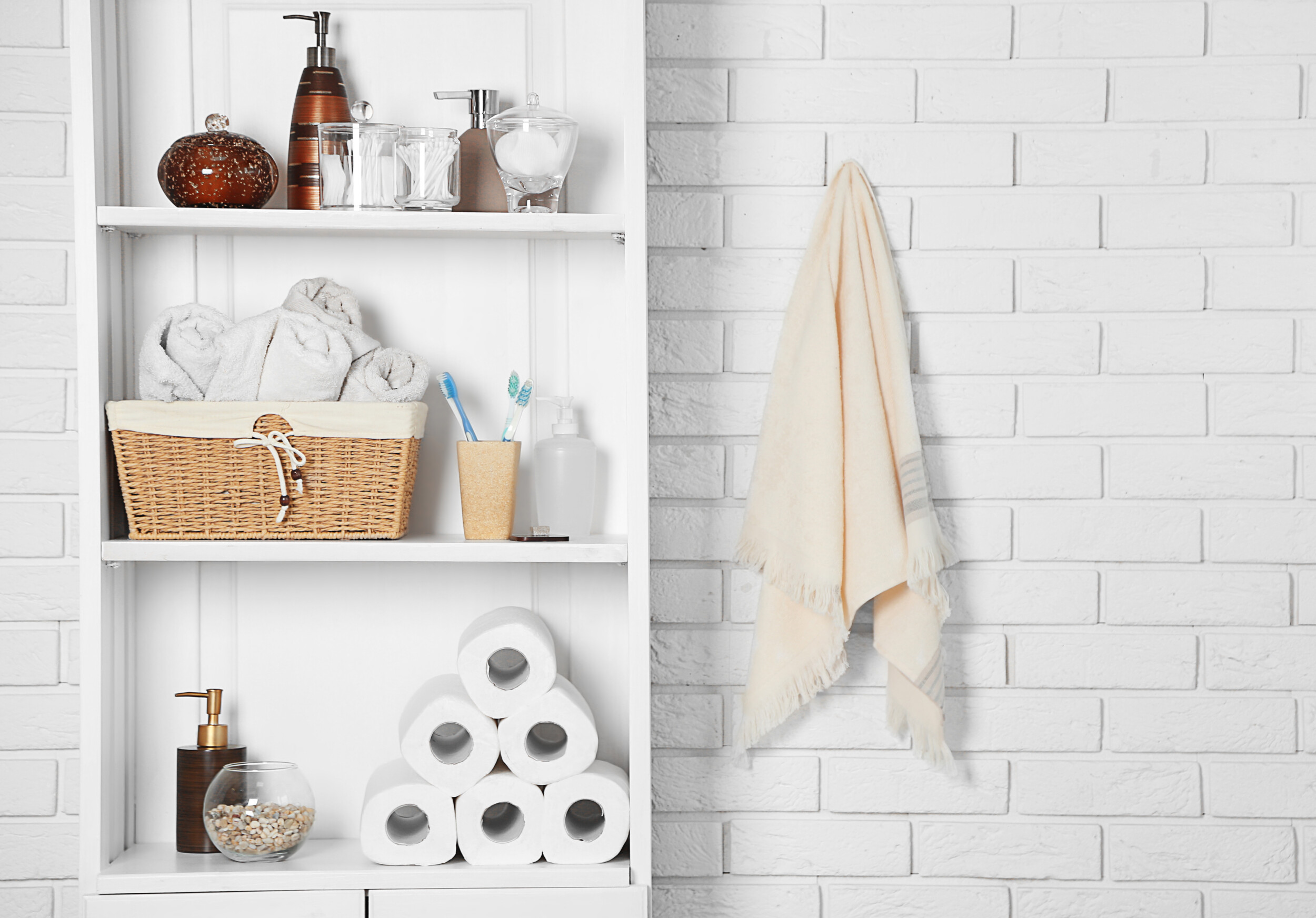
It’s not uncommon or uncalled for for various rooms in your home to have non-decor spaces as it gives the eye a break and keeps your home from looking cluttered or overly styled. That said, there are several spots in any home that most of us aren’t utilizing, especially above your toilet.
Consider adorning it with cosmetic items you use daily that are covered and concealed in matching vessels for uniformity and practicality.
Make Your Bookshelves Pop
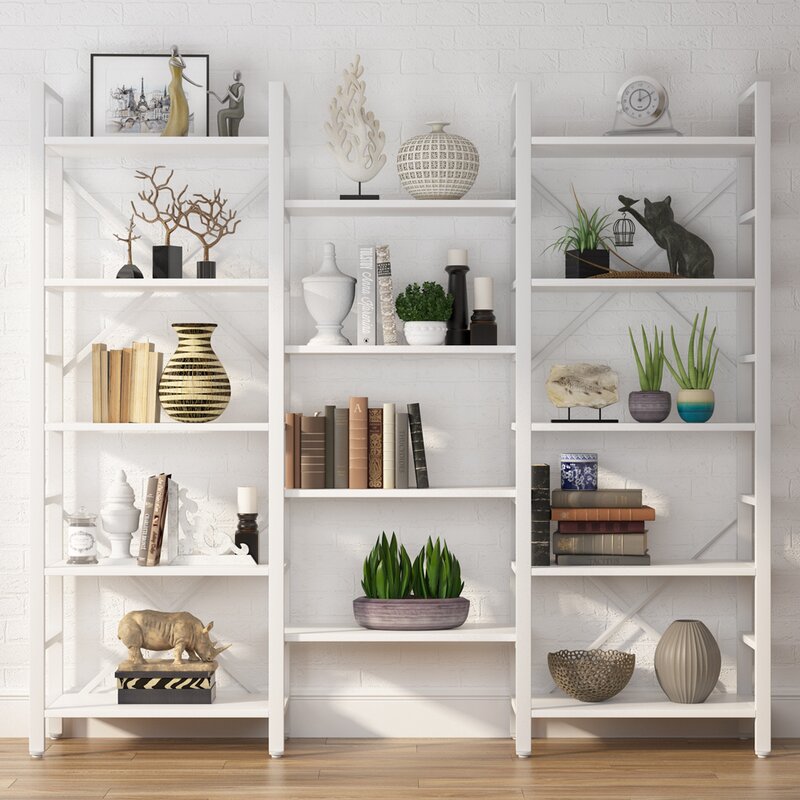
When home staging a client’s den, our designers were careful to keep decorative items relatively low key as the shelving unit runs along an entire wall, floor to ceiling. When it comes to shelving in a communal area like a living room, take time to figure out the right add-ons to display as everything you put on them will become a standout piece, especially with white shelving.
Create subtle mixes and levels of interest by displaying art, using stacked books as a foundation for vases and sculptures, and considerately placing prized knickknacks, figurines and a sprinkling of trinkets collected from your travels for a cozy, sentimental, and eclectic statement that will give you conversation starters when entertaining.
Create A Coffee Table With Visual Balance
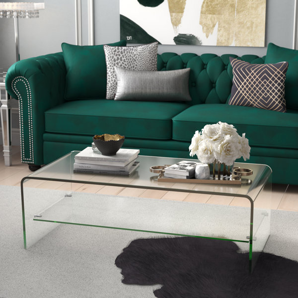
It’s still hard to believe that our designers only had 48 hours to decorate this living room from scratch. With every piece of furniture being full of gorgeous personality, they used a lucite coffee table to tie this living room’s bold elements together in decadent harmony and topped it off with minimal decorative elements to punctuate the room’s personality rather than compete with it.
For a room like this, go minimalist when thinking about tabletop styling tips when the furniture is visually heavy and look for pared-down extra’s that you can use as groupings for an alternative to flowers, which would have made it look entirely too busy.
Kitchen Shelving And Countertops
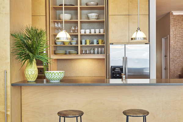
Open kitchen shelving may make a room appear larger while displaying your collection of tableware, however, they come with their own drawbacks – from catching dust to looking disorderly.
To avoid a randomly styled look, stick to monochromatic or complementary colors for uniformity and try to place as many matching items and styles as you have for visual consistency. The key with open shelving is to display items that you use and will wash often to keep everything looking clean. For countertops, again, we suggest sticking to items you truly use as you want to avoid looking like your home is permanently staged.

