Whether you’re about to decorate a new home or are looking into a room refresh, here’s a checklist of decorating mistakes that you should avoid to help you find success during the process.
STRICTLY STICKING WITH A DESIGN STYLE
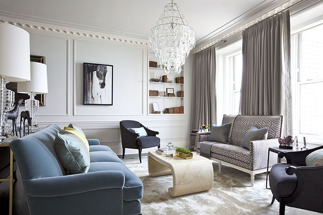
Sure, a dedicated design style will help guide you during the interior design process, but it’ll also keep you confined to just one decor style that will in the end, feel uninspiring to look at. Instead, create a visually interesting transitional mix of periods and styles for an unexpected approach that’ll afford you more freedom to work with.
KEEPING IT TOO UPTIGHT
One of the most common decorating mistakes Décor Aid interior designers see all too often is homeowners forgoing functionality for formality. But in reality, the more precious and untouchable a room feels, the less joyful it’ll be to use. And since you don’t live in a museum, there’s no reason to keep the feel of a room too uptight.
ART INSTALLED TOO HIGH OR LOW
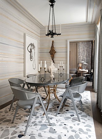
When installing art in your home, take a cue from modern art galleries and hang pieces up so that they’re perfectly at eye level for the best kind of impact. Because in reality, no one should have to keep looking up to take in what you’ve brought in.
A BADLY PLANNED LAYOUT
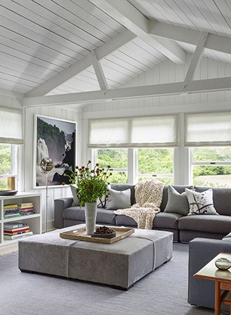
From a disruptive walking path to furniture that’s placed flush against the walls to a lack of conversational areas, furniture layout can really help define a room when done well. Be deliberate and practical with furniture placement to keep the feel well-appointed.
A RUG THAT’S TOO SMALL
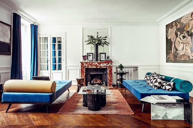
When decorating a space, most interior designers always suggest starting from the ground up. So think of flooring as a foundational starting point and don’t be shy when it comes to scale. Go for as large of a rug as possible to really make a grand statement.
BUYING EVERYTHING FROM ONE SOURCE
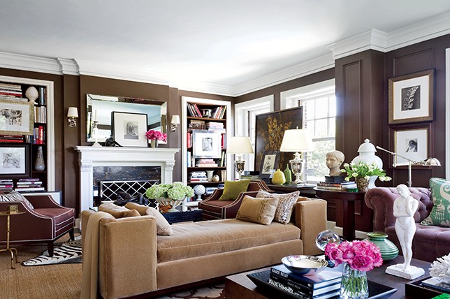
People stick to one brand all too often because it’s easier and you can get everything you need in one fell swoop. But by doing so, you’ll run the risk of your home looking like a one-note showroom. So unless you’ve won a contest from a brand, opt for a variety of furnishings sourced from trusted brands for a one-of-a-kind feel.
AVOIDING PLAYS ON SCALE
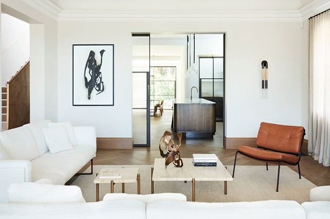
For a charmingly layered look, get creative with playful contrasts and bold juxtapositions to keep the eye moving and inspired by the unexpected. As when it comes to decorating mistakes, bringing in pieces that are the same size and height will make for a bland outcome.
A TELEVISION IS NOT A FOCAL POINT
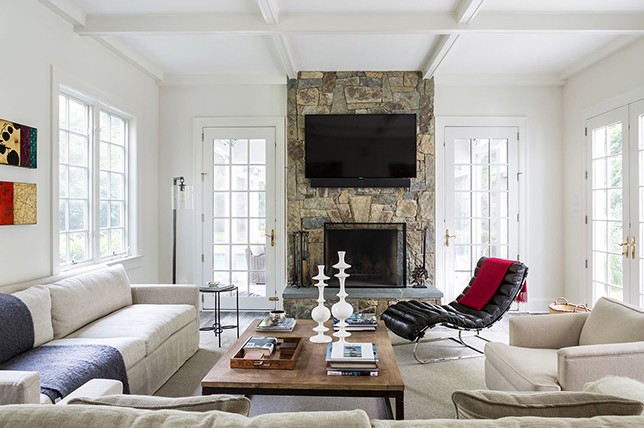
It may be great to gather around your television for a cozy night in, but it should in no way be a major focal point in any room. In fact, the more concealed the better, as there’s nothing sophisticated about the look of a television. But if you must have one, consider playing loops of short art films while it’s not in use.
GETTING TOO TRENDY
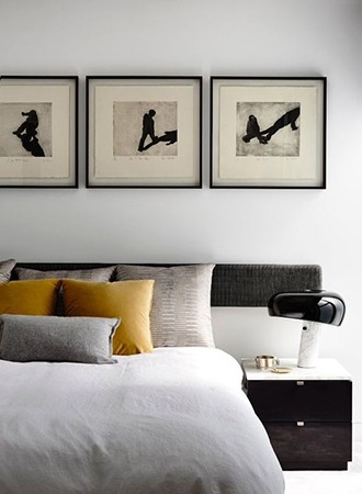
Pinterest and Instagram may be great for sourcing inspirational images, but by sticking too closely to what you see, you’ll end up with pieces that everyone has seen a million times. Instead, use Pinterest trends as decorative cues and explore how you can make elements of them unique to you.
SKIPPING OUT ON MULTI-PURPOSE PIECES
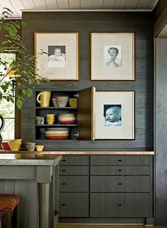
Sure, there are some pieces that are simply all about a great aesthetic, but no matter the size of your home, most pieces should have a multi-purpose capability. This will, in turn, help you make the best use of a space with functional and practical elements.
RELYING ONLY ON OVERHEAD LIGHTING
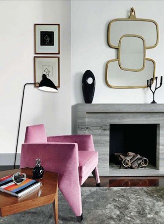
When it comes to lighting your home, one of the most drastic decorating mistakes we often see is a lack of layered lighting. Instead of relying on the cold and clinical feel of standard overhead lighting, create comforting layers of light via floor lamps, wall sconces, table lamps, and even candles all positioned at different heights.

