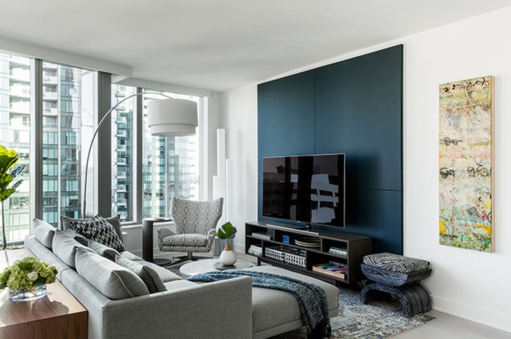
With characterless residential buildings popping up from coast to coast, Décor Aid decorators are often tasked with adding a sense of personality and warmth to otherwise bland, generic apartments such as this weekend getaway in the heart of San Francisco. Unlike other small apartment interior design projects, our client was fortunate enough to have a main residence, allowing our designer to focus almost entirely on aesthetics and comfort rather than solutions to fit the most one can in the space.

Looking to add a fresh, relaxed feel quickly for her monthly visits to the Bay Area, our client’s major concern was to tackle the space’s lack of character and comfort room by room with a decidedly contemporary spirit.
After selecting finishes for the small apartment interior design, Dècor Aid designer Mandy M. took advantage of the spaces’s sparse light-drenched rooms by punctuating the original white and gray color palette with bold yet soothing accents of color in an array of blues, for a sense of depth and attitude.
Mandy and her client then selected the main furnishings and layered on the accessories while continuing to look for unique smaller add-ons for a play on scale throughout the pied a terre.
Since the apartment was on the smaller side, our designer cleverly incorporated a series of the same elements in each room to tie everything together for consistency including marble accents and finishes, sleek chrome floor lamps, and consoles and desks boasting slim bases for an almost transparent look to avoid adding visual weight in each room.
With an open floor plan uniting the common rooms, a prominent gray L-shaped sofa was used as an anchor while mirroring the kitchen cabinetry’s smooth gray surfaces. To emphasize the natural light and avoid dark tabletops, a white Carerra marble coffee table and Saarinen dining table were sourced with both echoing each other due to their round tops and scale. For an unexpected feminine feature in the dining area, Mandy added Phillipe Starck’s Caprice chairs featuring a sleek silhouette and seats that give the impression of delicate lace – again, in gray to tie everything together.
Our client was particularly interested in finding a way to blend the large TV in the living room seamlessly without completely hiding it.
“We came up with the idea of large painted canvases to mount on the wall behind the TV – that way; it blends in with the dark canvases behind.”
A contractor was then brought in to craft refinements for the small apartment interior design project including the installation of Sisal wall coverings in the master bedroom to soften the room and make it more inviting. He also added a wooden valence in the living room to hide the window treatment’s cassettes.
In the master bedroom, Mandy created a feminine vibe with a colorway of soft blues and lavenders balanced by the symmetry lent from a handsome, patterned nailed headboard and Rowe nesting side tables from Serena & Lily.
The guestroom was energized with deep, moody blues, a statement-making horn lamp, and framed animal prints by Sharon Montrose that add a natural, outdoorsy element in this otherwise thoroughly modern apartment. Striking black and white extras including an abstract striped desk chair and handcrafted Parsons-inspired side tables incorporated in the room added a sophisticated polish to bring everything together harmoniously.
In what was originally a dull space, the result has a crisp, pulled together vibe loaded with texture, soothing hues and the sense of personality our client was hoping for when considering the best small apartment interior design for her space.
